Making a Second House a Home
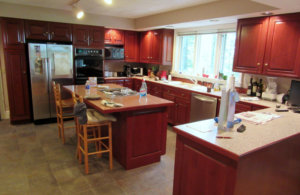
When I first walked into this Sunapee kitchen, I could tell this was a kitchen that had seen thousands of family dinners, where parties and informal gatherings had budded and bloomed, where a busy family had landed after weekend days full of skiing. It was a space of love, complete with worn Formica and aging appliances.
But the family who uses this house as a weekend getaway, especially during ski season, was ready for an update. They wanted more space, more functionality, and more light.
We knew this was going to be an invasive project, but we wanted to keep the construction to a minimum. Part of the project was finding places to make space, and to do this we needed a builder who was very conscientious and detail-oriented. Lee Perkins Building out of Warner, New Hampshire, was the perfect fit. Not only is Lee detail-oriented, he’s also an innovative thinker who thrives on figuring out the “how” for some of our design elements.
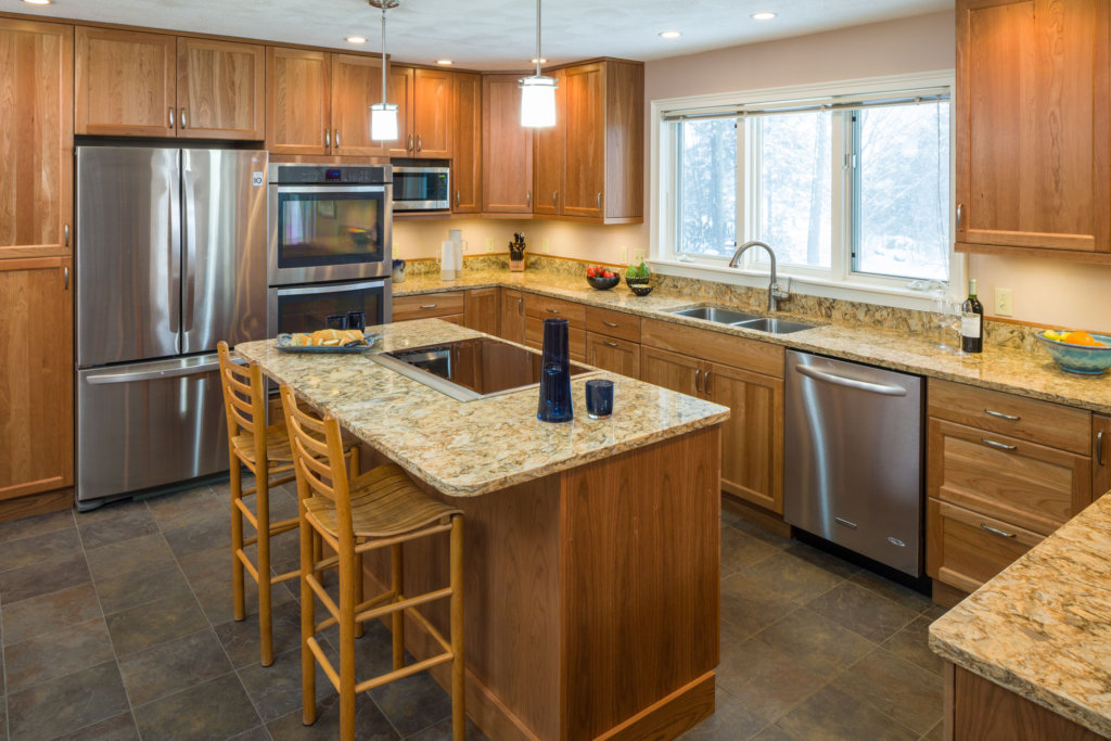
So how we were able to create space where none existed before without changing the overall footprint and even returning some of the appliances to their original spots? Magic? Not quite.
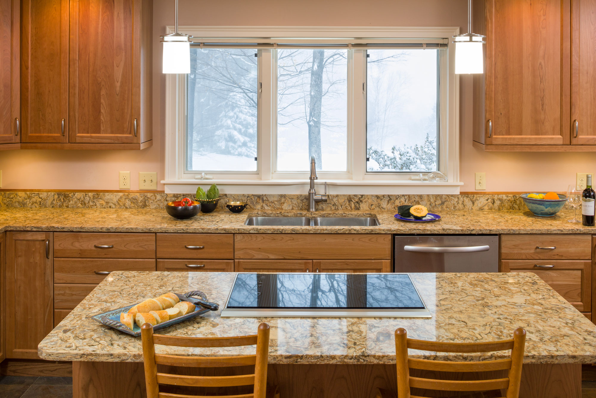
Instead, the soffit ceiling was dismantled, granting the cabinets another 6 inches in vertical space. Double-hinged corner cabinets with built-in rotating shelving were installed. A pullout drawer for trash and recycling receptacles was cleverly inserted under the countertop. Frameless cabinetry made with dovetailed maple allow for both cleaner lines and more interior space. These cabinets were extended to be flush with the appliances, affording another few inches of storage.
Overall, I’d guess that we increased the amount of storage by 20 percent, simply by finding solutions in the details.
By having extensive conversations with the owner about how she uses her kitchen, where she stands, even what she keeps in every drawer, we were able to design the space around her personal needs instead of asking her to adjust to the new space. Even the drawers under the stovetop were redesigned to be useable—the pull-out shelves are molded around the ducts to allow for even more storage. Consider the multi-level spice drawer that’s easily accessible to the person standing at the stove, and you’ve got a kitchen that serves as a place to indulge a passion for cooking, a space for family and friends to sit and share appetizers, or a restful spot for an early morning cup of coffee.
Shaker style cabinetry made from natural cherry with a clear finish that offers hints of the color that will deepen over time. Granite countertops gleam with the promise of easy cleaning. Below-cabinet lights make the illuminated work surface inviting and expansive. Steel appliances reside together in a style family that includes the sink and cabinetry hardware. This kitchen is a place where you want to linger.
One thing that makes the room so inviting is the light streaming in from the triple-window array above the stainless-steel sink. Sometimes, there’s a bit too much light. The solution? We designed outside awnings to shade the windows from the sun. Not only does this add a European flavor to the outside patio, it keeps the kitchen from warming by blocking the solar energy before it even enters the room, instead of trapping it via curtains or blinds.
As so often happens at the end of a project, the client saw the work that was done in one room and then turned to me and said, “Now I need to show you the other rooms that need help.”
Those rooms were the bathrooms. One located in the master suite and two that were used by family and guests. All bathrooms needed one main thing: space.
-
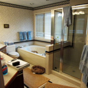
- Bathroom Before
-
- Bathroom After
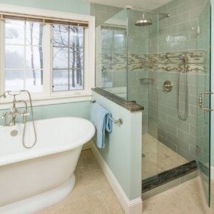
One way we created more space in the master suite was by replacing an enormous bathtub with a freestanding tub that allows nearly as much bathing space but cuts out about 8 inches of surrounding material. Then, we managed to expand the shower by moving a retaining wall as far to the window as possible and using a frameless glass shower unit. Not only did this gain actual inches within the shower, it also creates the illusion of even more space.
On the side of the bathroom opposite the tub and shower, more space was gained by using wall faucets above the double square sinks, which means the stone counter needs fewer inches of floor space. An added bonus to wall faucets? Cleaning is a breeze! The cabinetry follows the same Shaker style as the kitchen, maintaining the holistic feel of the house as an integral unit.
Pale, modern colors abridged with matching tiles help maintain the feeling of peaceful sanctuary. The same techniques were used in the remaining bathrooms, where simple moves such as replacing outdated tile for more modern looks made huge leaps.
It all reminds me that when considering how to make your weekend house more of a home, kitchens and bathrooms are the spots where meticulous attention to detail and usability can transform a room into a sanctuary.
Comments are closed.